 |
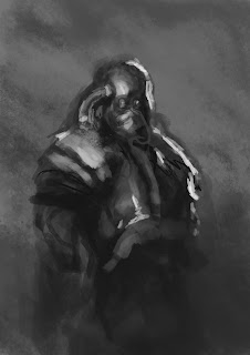
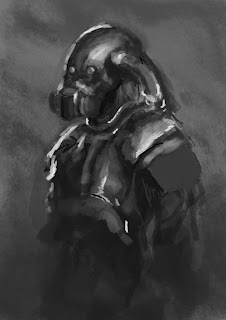
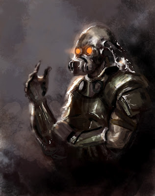
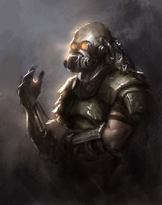
| Rough quick sketches of compositional ideas |
Wednesday, 21 March 2012
Night Crawler Moodboard
Here is a moodboard of reference images for possible compositions for creating my own digital painting of Night Crawler. For this brief I will use the brushes and techniques learnt from Darken's tutorial.
Copy of Darken's work
Heres are the steps I took, showing my progress in creating a transcript of the artists work. I followed his video tutorial and looked at his photoshop file to try and create an accurate copy of Darken's work/technique.
Heres what I got to so far.
 |
| I have created a smoky effect using the artist's brush by blending in different hues of grey together. I like this brush and may use this further in my digital paintings. |
 |
| Here I have moved the head up so that I could have enough space for the neck. |
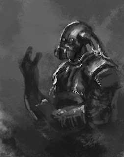 |
| I then started blocking out colour and adding detail to the arm. |
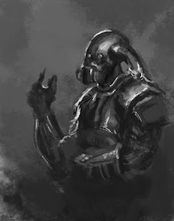 |
| Here I started working on the arm detail. |
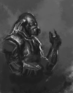 |
| I then flipped the piece to see whether the perspective of the arm looked okay. |
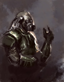 |
| Started adding colour to the piece using overlays and playing around with adjustment layers and colour balance. |
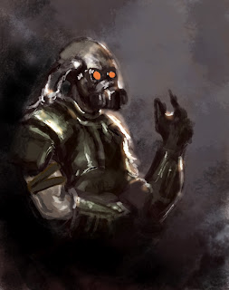 |
| I then started adding the dark areas in the background to make the soldier stand out more appearing from the darkness. |
Below is Darken's original work that I have created a transcript of above.
Copy of Bobby Chio's work
Picture below is an section of Bobby Chio's piece in which I have chose to create a copy of.
Here are the steps I have taken to create a transcript of Bobby Chio's work using his techniques.
 |
| Artists work |
Here are the steps I have taken to create a transcript of Bobby Chio's work using his techniques.
 |
| I began creating a greyscale drawing first like the artist. Outlining a rough shape of the creature's body. |
 |
| I then added more hues to the drawing. |
 |
| I then changed the flow, size and opacity of the brush to add detail for the fur. To make it blend in well. |
 |
| Then added overlays and played around with adjustment levels to get the lighting accurately I could like the artist's piece. |
 |
| Now I need to add the leaves textures and detail and work on the character. |
 |
| Started adding vegetation to the branches searched on internet for reference images and used the clone tool to blend the textures together. |
 |
| Then began adding detail to the vegetation and adding fur using 1px size brush. |
 |
| Adding more detail to the fur. |
 |
| Working on the small creature adding tone. |
 |
| Adding more tone. I realised the face did not look quite right so I made changes to it when I started adding colour on top. |
Copy of Bobby Chio's work
 |
| Heres a quick sketch I made following the video tutorial. |
 |
| I then began adding the light and dark areas using the standard brush and setting the flow to 10% |
 |
| Starting outlining the character and composition. |
 |
| Here started adding light and dark tones. |
 |
| Started working more into the foreground and background. Adding the tree branches. |
Wednesday, 7 March 2012
2D tutorial
Sorry my computer has gone in for repair so I couldn't get much done. However I did watch the video tutorial and looked at the PSD files. Will catch up with this brief soon, when I get my laptop back.
Subscribe to:
Posts (Atom)


