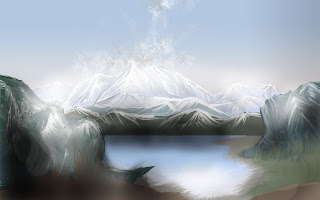
I like how they start creating shapes with the lasso tool (foreground and background) and then fill them with using colour gradient. Further adding detail and texture on top. I don't really use the lasso tool as much but I can see how useful it could be if incorporated further in my work. This will help create an realistic forms and shapes in my work. From following this tutorial I have learnt some useful techniques with the smudge tool. (finger painting, sample all layers etc)
Heres the link
http://www.pxleyes.com/tutorial/photoshop/1329/Create-a-Realistic-Landscape-from-Scratch-with-a-Graphic-Tablet.html
 |
| I then began using the smudge tool and highlighting areas where the light would hit which would be the top of the mountains. I did this with finger painting selected to achieve a different result. |
 |
| Then began adding more detail to the mountains. |
 |
| I then began working into the other mountains. |
 |
| I then started working into the foreground rocks. |
 |
| I then further added more detail to the piece I ticked on the option sample all layers which was a more effective way of smudging and blending the colours together. |
 |
| I then did the same to the lake to make it look more realistic by creating random swirls with the smudge tool to achieve this effect. I also added a smoke effect using a brush from Darken's Tutorial. |


No comments:
Post a Comment