Thursday 26 April 2012

Heres a 3D hut I created in 3Ds max for a student for film production. As a quick visualisation for their hut.


A simple basic hut design with 4 walls. 


Circular hut with 7 walls


Painting an Artist piece in ImagineFX

I wanted to work on my painting skills in photoshop so I used the artists piece Sam Burtley work and painted over it by following his tutorial to learn some useful techniques. Sam Burtley creates brilliant colourful sci-fi drawings of landscapes.

Artist Sam Burleys Work
The artist creates a realistic sci fi landscape with the use of tone and interesting composition 

I have here added colour to the piece by following his tutorial. He uses  overlay and colour hue and saturation to create an realistic colourful landscapes. I like way the artist fills in the colour in a very easy and quick way from creating a greyscale drawing first.

For my next piece I will use his technique in my work. I have chosen to create my own landscape below following his technique started from a greyscale drawing.


 I began with blocking in colour and shape to get an interesting landscape composition.
 I then added tone and shade to the piece
 I then added more definition and detail  to the drawing. Highlighting the waves and shadow from the palm trees and rocks
 I then added more strokes to the waves to make the water look more fierce.
 I then added an overlay filling the drawing with basic colour.
 I then further added colour and pattern to the drawing by changing the size of the brush to work on more detail.
Here is my final drawing in colour. I am pleased with the overall look of the piece. If I had more time I could work more into the palm trees to make them look more realistic. I enjoyed working on this piece starting from a greyscale drawing  and adding colour overlays on top with further textures.


Tutorial in ImagineFX

Working on a tutorial in ImagineFX magazine by Kev Crossley. Using the smudge tool to blend the colours together to create interesting eye-catching portraits.

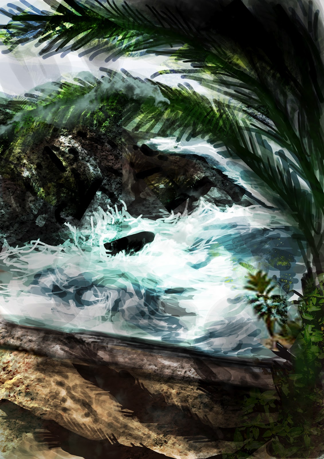
I firstly blocked in the basic colours into the piece.


 Here I started working into more detail, blending the colours in more.  Changing the opacity and size of the brush
 I then used the dodge tool to blend the colours in more to achieve a nice smooth effect.
I then started adding the hair in. I quite pleased with the outcome of this piece from following the artists tutorial. I have learnt some useful tips on how to work on creating realistic portraits. 

Tuesday 24 April 2012

Landscape Brief

For this brief I have chosen to work on creating a realistic landscape with a tablet. I followed techniques from Pxleyes.com
I like how they start creating shapes with the lasso tool (foreground and background) and then fill them with using colour gradient.  Further adding detail and texture on top. I don't really use the lasso tool as much but I can see how useful it could be if incorporated further in my work. This will help create an realistic forms and shapes in my work. From following this tutorial I have learnt some useful techniques with the smudge tool. (finger painting, sample all layers etc)

Heres the link

http://www.pxleyes.com/tutorial/photoshop/1329/Create-a-Realistic-Landscape-from-Scratch-with-a-Graphic-Tablet.html


Here I used the lasso tool to create the background and foreground layers of the mountains, rock and lake. I then filled them in colour using the gradient tool.  As the further away the object is  in background the lighter the colour is compared to the foreground. 

I then began using the smudge tool and highlighting areas where the light would hit which would be the top of the mountains. I did this with finger painting selected to achieve a different result. 

Then began adding more detail to the mountains. 

I then began working into the other mountains.

I then started working into the foreground rocks. 

I then further added more detail to the piece I ticked on the option sample all layers which was a more effective way of smudging and blending the colours together. 

I then did the same to the lake to make it look more realistic by creating random swirls with the smudge tool to achieve this effect. I also added a smoke effect using a brush from Darken's Tutorial. 

I further added a colour dodge effect to hight light the white areas but I think I could work into this more by reducing the white glow as it needs to be blended in more. As this is the main focus where your eye is drawn to.


I have applied a gradient ontop with overlay to make the drawing look more realistic. I like this version better. Overall I am have learnt some useful techniques from following this technique and I am pleased with the outcome. If I had more time I would wok on adding detail and tone. To make it look more realistic.  With more and more practise with the smudge tool I will hopefully will become better at it.


Heres my drawing in black and white.