Wednesday 16 May 2012

Still life sketch in Photoshop

I have chosen to do a still life sketch in Photoshop to practise on my sketching and painting skills in Photoshop. I followed this technique from a tutorial. http://www.youtube.com/watch?v=qhK7kraboq4 
I got carried away and forgot to save the development stages as the colour was all on one layer.
Started off with a quick basic sketch of fruits and blocked the areas where the shadow would be. 

I then added a normal layer on top, adding the main colour which I blended with different hues to help create an realistic effect. I used a pastel brush to help achieve this effect. I quite like this effect and could incorporate it further in my work to make my work stand out more. 


Thursday 26 April 2012

Heres a 3D hut I created in 3Ds max for a student for film production. As a quick visualisation for their hut.


A simple basic hut design with 4 walls. 


Circular hut with 7 walls


Painting an Artist piece in ImagineFX

I wanted to work on my painting skills in photoshop so I used the artists piece Sam Burtley work and painted over it by following his tutorial to learn some useful techniques. Sam Burtley creates brilliant colourful sci-fi drawings of landscapes.

Artist Sam Burleys Work
The artist creates a realistic sci fi landscape with the use of tone and interesting composition 

I have here added colour to the piece by following his tutorial. He uses  overlay and colour hue and saturation to create an realistic colourful landscapes. I like way the artist fills in the colour in a very easy and quick way from creating a greyscale drawing first.

For my next piece I will use his technique in my work. I have chosen to create my own landscape below following his technique started from a greyscale drawing.


 I began with blocking in colour and shape to get an interesting landscape composition.
 I then added tone and shade to the piece
 I then added more definition and detail  to the drawing. Highlighting the waves and shadow from the palm trees and rocks
 I then added more strokes to the waves to make the water look more fierce.
 I then added an overlay filling the drawing with basic colour.
 I then further added colour and pattern to the drawing by changing the size of the brush to work on more detail.
Here is my final drawing in colour. I am pleased with the overall look of the piece. If I had more time I could work more into the palm trees to make them look more realistic. I enjoyed working on this piece starting from a greyscale drawing  and adding colour overlays on top with further textures.


Tutorial in ImagineFX

Working on a tutorial in ImagineFX magazine by Kev Crossley. Using the smudge tool to blend the colours together to create interesting eye-catching portraits.

I firstly blocked in the basic colours into the piece.


 Here I started working into more detail, blending the colours in more.  Changing the opacity and size of the brush
 I then used the dodge tool to blend the colours in more to achieve a nice smooth effect.
I then started adding the hair in. I quite pleased with the outcome of this piece from following the artists tutorial. I have learnt some useful tips on how to work on creating realistic portraits. 

Tuesday 24 April 2012

Landscape Brief

For this brief I have chosen to work on creating a realistic landscape with a tablet. I followed techniques from Pxleyes.com
I like how they start creating shapes with the lasso tool (foreground and background) and then fill them with using colour gradient.  Further adding detail and texture on top. I don't really use the lasso tool as much but I can see how useful it could be if incorporated further in my work. This will help create an realistic forms and shapes in my work. From following this tutorial I have learnt some useful techniques with the smudge tool. (finger painting, sample all layers etc)

Heres the link

http://www.pxleyes.com/tutorial/photoshop/1329/Create-a-Realistic-Landscape-from-Scratch-with-a-Graphic-Tablet.html


Here I used the lasso tool to create the background and foreground layers of the mountains, rock and lake. I then filled them in colour using the gradient tool.  As the further away the object is  in background the lighter the colour is compared to the foreground. 

I then began using the smudge tool and highlighting areas where the light would hit which would be the top of the mountains. I did this with finger painting selected to achieve a different result. 

Then began adding more detail to the mountains. 

I then began working into the other mountains.

I then started working into the foreground rocks. 

I then further added more detail to the piece I ticked on the option sample all layers which was a more effective way of smudging and blending the colours together. 

I then did the same to the lake to make it look more realistic by creating random swirls with the smudge tool to achieve this effect. I also added a smoke effect using a brush from Darken's Tutorial. 

I further added a colour dodge effect to hight light the white areas but I think I could work into this more by reducing the white glow as it needs to be blended in more. As this is the main focus where your eye is drawn to.


I have applied a gradient ontop with overlay to make the drawing look more realistic. I like this version better. Overall I am have learnt some useful techniques from following this technique and I am pleased with the outcome. If I had more time I would wok on adding detail and tone. To make it look more realistic.  With more and more practise with the smudge tool I will hopefully will become better at it.


Heres my drawing in black and white.


Wednesday 21 March 2012

Night Crawler Moodboard

Here is a moodboard of reference images for possible compositions for creating my own digital painting of Night Crawler. For this brief I will use the brushes and techniques learnt from Darken's tutorial.


Rough quick sketches of compositional ideas


I created this on top of the silhouette I created. I  have a further developed piece of this, working more into the tone, shade and composition as well as tidying up the outline. I have also worked more into the face.


I decided to create Night Crawler in a different composition, flying backwards jump which looks more interesting than him just crouching. I thought this would work out better for a magazine cover compared to my first attempt

I then added the main base colours onto my drawing. 


I decided to place Night Crawler in a foggy misty background using the brushes from Darken's tutorial. 

Here's the final image of my drawing of Night Crawler.  I am pleased with the progress I have made from my first attempt the colouring, shading and composition looks much better.


Copy of Darken's work

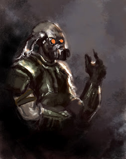
Heres are the steps I took, showing my progress in creating a transcript of the artists work. I followed his video tutorial and looked at his photoshop file to try and create an accurate copy of Darken's work/technique.

Heres what I got to so far.

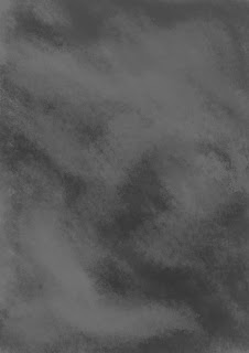
I have created a smoky effect using the artist's brush by blending in different hues of grey together. I like this brush and may use this further in my digital paintings.

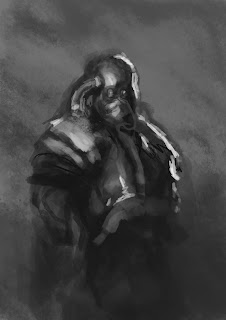
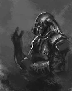
As I was following the video tutorial, I also followed some of his mistakes to learn some useful tips. In this step the soldier does not have a neck so the next step was to use the lasso tool and play around with the perspective using distort and warp which was useful.

Here I have moved the head up so that I could have enough space for the neck.

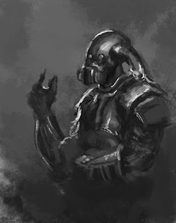
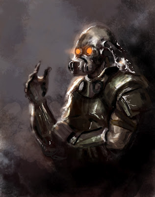
I also kept flipping my canvas horizontally like the artist to see whether the perspective and shading looked right. In this step I realised that I did not have enough canvas space to draw the arm. So I extended it using the crop tool and filled in the smoky background again blending it in. To avoid solid lines being visible.

I then started blocking out colour and adding detail to the arm.

Here I started working on the arm detail.

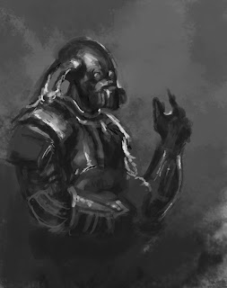
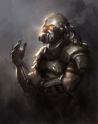
I then flipped the piece to see whether the perspective of the arm looked okay.

Started adding colour to the piece using overlays and playing around with adjustment layers and colour balance.

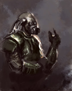
I then started adding the dark areas in the background to make the soldier stand out more appearing from the darkness.  


Heres's what I got to so far. I am quite proud of this piece as  I have learnt some very useful techniques how to create a cool smoky effect, I also enjoyed playing around with his brushes. He also uses adjustment layers and colour balance to decide on his overall look and colour of the piece which was also useful. To improve I could work on the body more making him look more muscular like the original. If I have time I will try and develop this further with the extra detail and textures he has applied in his final painting.


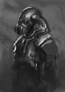
Below is Darken's original work that I have created a transcript of above. 

Darken's work